Context

🔖 Overview
RedMart is a Singapore-based online supermarket, brings grocery shopping convenience right to your doorstep. In 2016, RedMart was acquired by Lazada, a leading Southeast Asian online shopping platform. Today, they operate on Lazada's platform, offering a mix of marketplace options, where sellers manage their listings, and directly sold products
👫 Stakeholders
For this project, I regularly communicated with Business Team to update them on my progress and proactively sought feedback. I also checked with the Tech Team and Product Team to identify any limitations or restrictions and proposed solutions to any roadblocks encountered.
Problems
😰 Challenges
Information overload
With a vast product range, RedMart might struggle to present all relevant details (nutritional information, ingredients, etc.) clearly and concisely on the page.
Visual hierarchy and clarity
A cluttered product page with poorly prioritized information makes it difficult for users to scan and find what they they need quickly.
Component consistency
Old component design needs updating and must be consistent with other RedMart core pages.

Design Process
🤺 Competitor Benchmarking
As always, my first step was to conduct competitor benchmarking. Since RedMart on Lazada is currently only available in Singapore, I focused on several of RedMart's competitors in that market, such as NTUC Fairprice, GRAB, and PandaMarket. This analysis helped me understand how these competitors operate and the features they offer.
I also created a list of the content they display to users and identified both positive and negative aspects that RedMart could potentially implement based on these competitor insights.

📒 Previous research result
I requested the Research Team to send me several recent research documents on Product Detail Pages (PDPs), specifically focusing on both RedMart PDPs and Lazada PDPs.
Notes: It's important to note that due to differing needs, RedMart PDPs differ from Lazada PDPs.

After summarizing the research results, I identified several key insights:
User feels that still dissatisfied with limited product information and assortment, unclear and confusing promotions as well as visual aspects
User’s expectation are cleaner layout, easy access to vouchers/discounts, and better accessibility to view products/items
User expected to see the following as key information on the PDP:
Price
Voucher/discounts
Ratings & reviews
Number of products sold
Product details/description
Information related to delivery
Variations
Store/Seller ratings
Return policy
Recommended stores
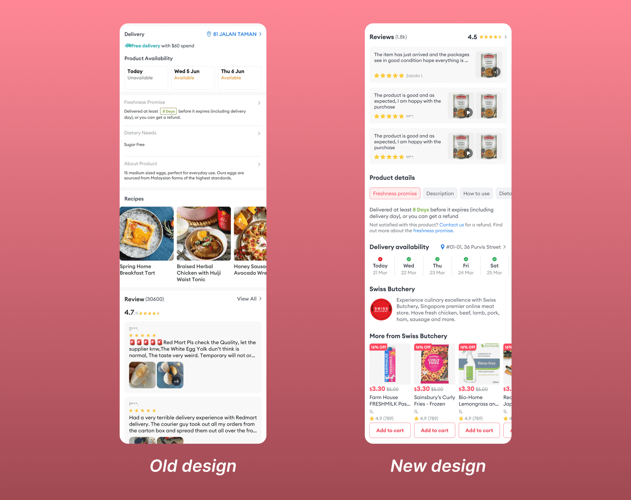
🔎 Identified current problems
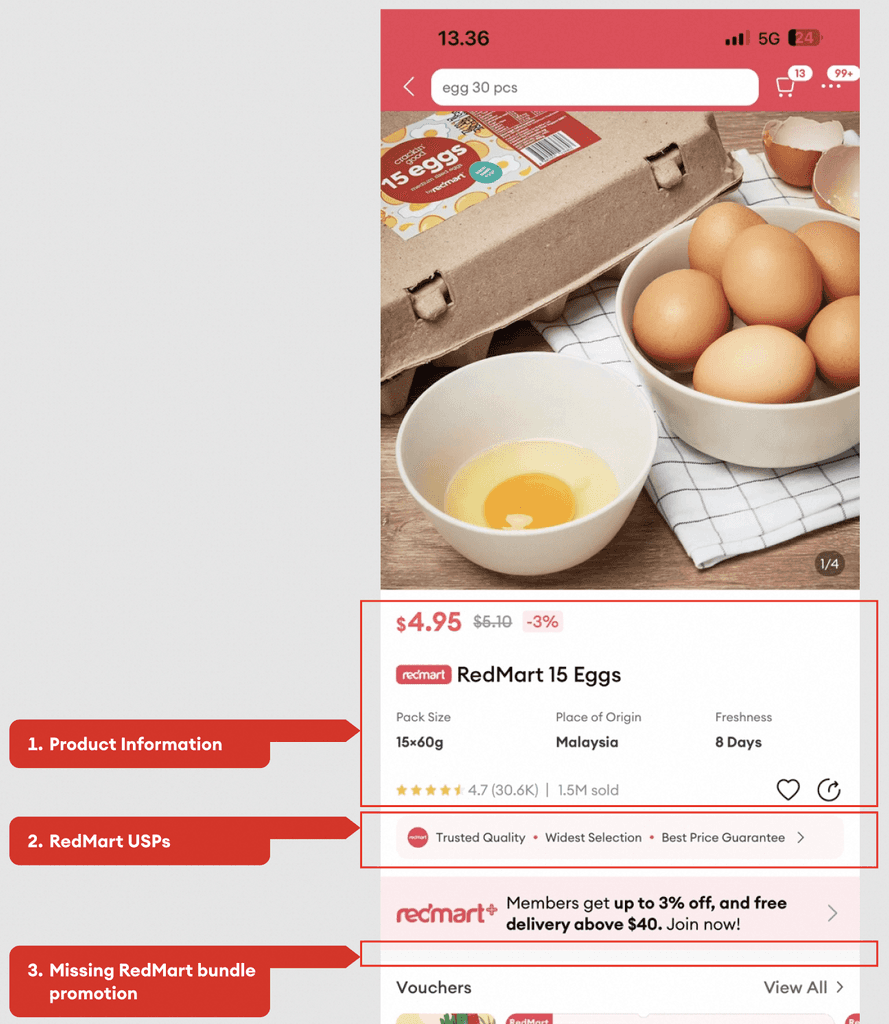
Product Information Hierarchy
Lacks a clear hierarchy for product information.
RedMart USPs
Visuals aren't strong enough to attract users and convince them RedMart is the right choice.
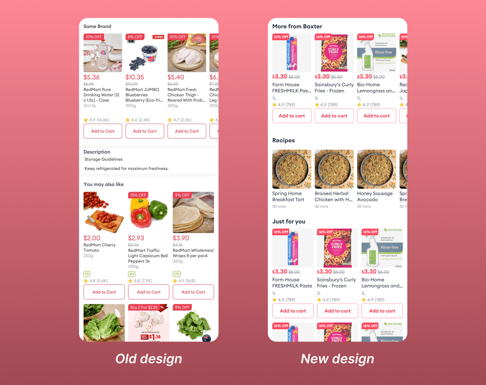
RedMart Bundle Promotion
Lacks a module for users to purchase bundles.

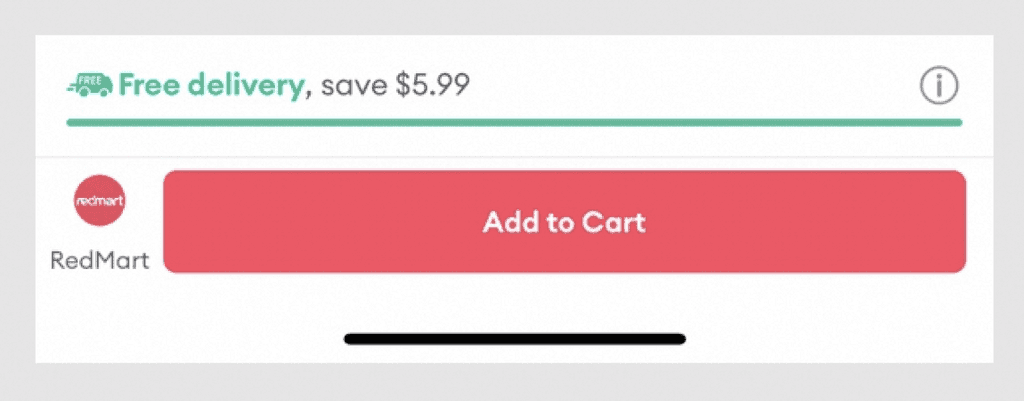
Delivery Calculation
Presents redundant information already available in the bottom navigation module.
Product Availability
Visuals appear clickable but are not.
Product Details
Too much information overwhelms users at once.
Recipes
Missing crucial information – total recipe preparation time.
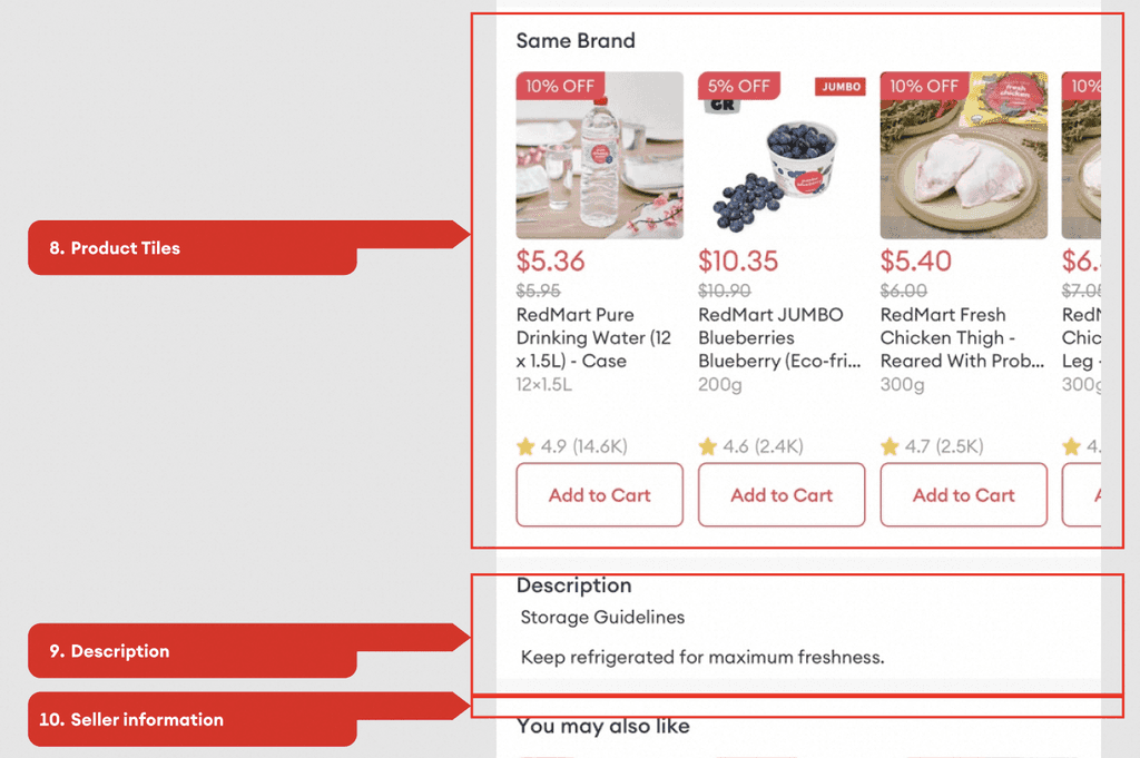
Product Tiles
Update product tiles to a more modern design.
Description
Move the description section above product details for better information flow.
Seller Information
Include seller information on the product page.