
By making the cross-sell design approach visual, interaction and copy more integrated with the e-ticket component, we can ‘balance’ the page intent between managing booking and enhancing product or travel needs. So that we can optimize our cross-sell rate while maintaining the minimum contact rate.
Design Goals
How can we optimize the e-ticket page design to integrate contextual and relevant cross-sell offers while maintaining hygiene functionality, ensuring a ‘balance’ between improving cross-sell visibility and adoptions, while keeping Contact Rates low and Self-Service Adoption Rates high
What principles are used by the E-ticket (Platform) team to maintain the overall functionality of e-ticket page?
What have we learned about how users interact with the e-ticket page (e.g user behavior, principles, things to consider, etc. )?

E-ticket sempat di revamp beberapa kali, namun untuk bagian cross-sell-nya tidak perlua di deep dive how to sell it, sehingga selalu menyediakan spot untuk masukkin cross-sell doang.
Always be hard-selling
Dikarenakan dalam revamp E-ticket, bagian cross-sell hanya di kasih spot untuk masukkin cross-selling item doang. Tanpa dipikirkan context dan relevancy-nya, yang menyebabkan cross-sell di e-ticket selalu hard-selling

Balance on the e-ticket page means prioritizing manage booking as the core intent, ensuring that cross-sell offers are seamlessly integrated without disrupting or altering the user’s focus on managing their booking—any attempt to provide product offer on the page will be considered as a ‘disruptor’ and preferred to be less prioritized.
Refined definition

Balance on the e-ticket page means recognizing dual intents:
Managing bookings
Enhance product/trip.
Meanwhile also ensuring :
Booking information could and should supports cross-sell, and cross-sell shouldn’t disrupt booking information.
Users that want to enhance their main products or trip are not ‘redirected’ to manage bookings, and those managing bookings are not ‘redirected’ by the cross-sell offer or even forget their main intent.
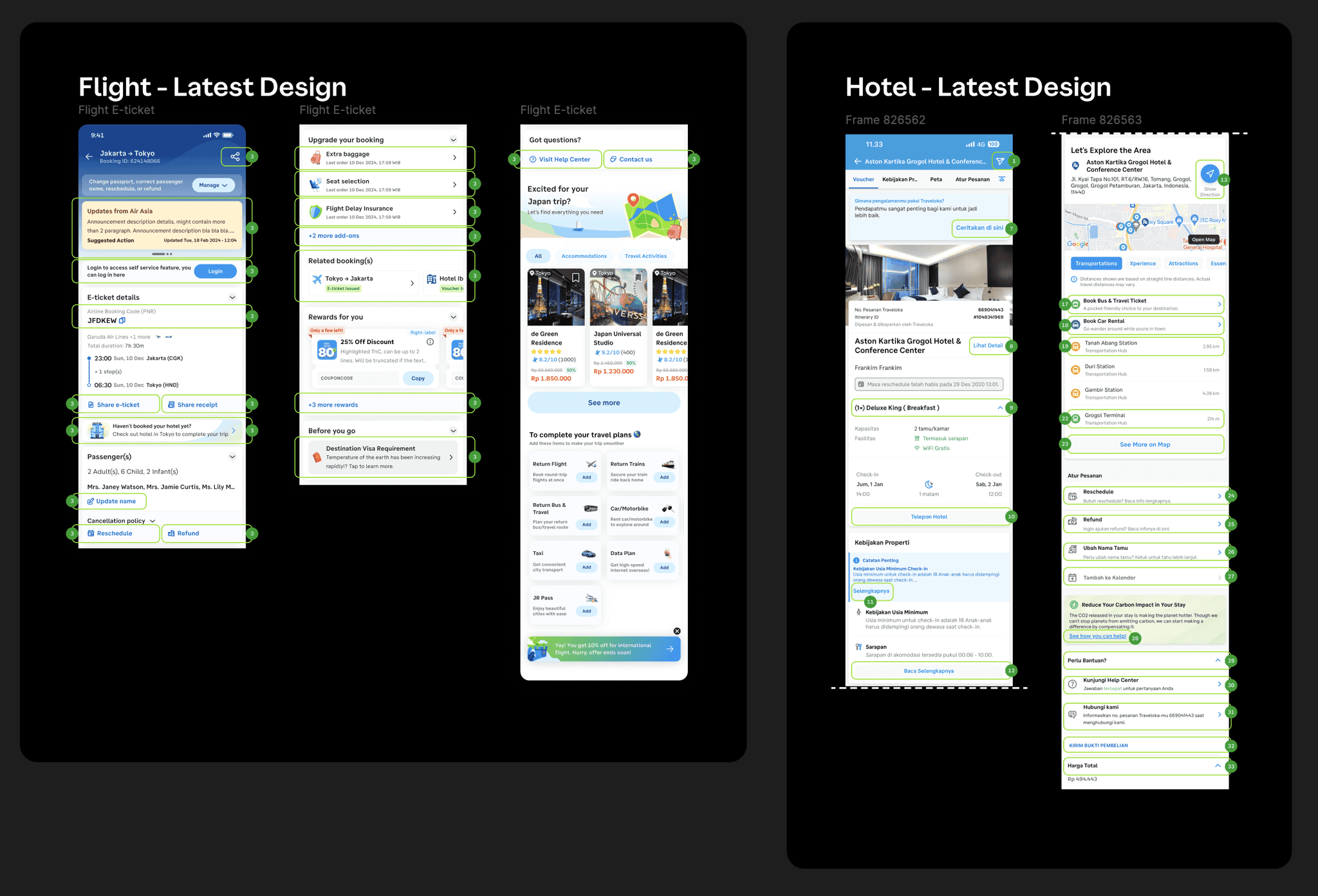
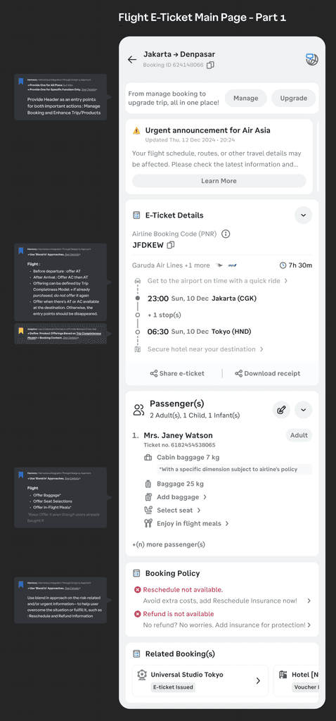
Latest Flight & Hotel E-ticket

Only prepare the place to adding the new components
There are several initiatives in e-ticket, most of the initiatives are adding and introducing new components, including cross-sell components

Inconsistent design and placement of page navigation across the product (Flight & Hotel)
This inconsistency might confuse users and increase the effort required to complete tasks when searching for relevant information in e-tickets.

Some components in e-tickets across products have the same menu and function, but differ in terms of language and style.
This inconsistency might confuse users and increase the effort For same function (refund and reschedule), the description / subtitle shown is different for each product which might confuse user
Not centralized maintenance and tracking, might need more effort to scale/platformize
The placement of the cross-sell potentially overlapping with each others which can be optimized further
This might not only result in irrelevant recommendations and lower adoption rates but also increase the user's cognitive load in the e-ticket system.
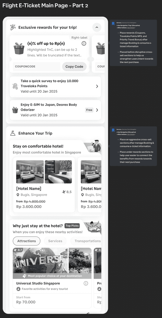
Contextual Suggestions
By offering tailored suggestions, it minimizes user effort to achieve its goals.
Recommend cross-sell information at the right time, with the appropriate communication angle, placement, and content.
Free Path Shopping

Stores like Indomaret, Alfamart, Ranchmarket, Lotte Mart, Hypermart, Transmart, etc. use free-pattern layouts, allowing customers to move through the space as they choose. Products are organized into specific place, but users decide their path based on their intent.
A free-pattern approach lets visitors have control over what they want to achieve and how they get there.
Resonant/Seamless Zoning
This approach uses visual and functional continuity to ensure different spaces feel cohesive and interconnected. By repeating design elements (e.g., materials, colors, or textures), we can create a harmonious flow between areas, giving all spaces equally presented while maintaining their unique functionality.
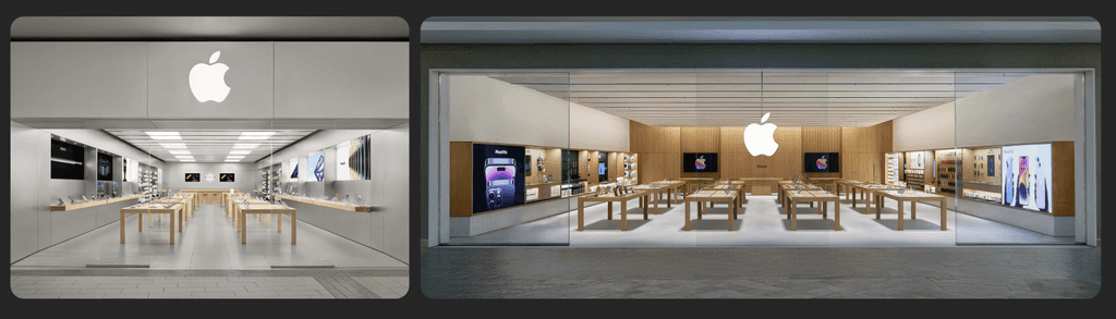
For example : Use the same design components : Apple Store
Apple stores create a seamless experience by using consistent materials (glass, steel, light wood) and layouts across all product area, e.g. the product display tables are evenly spaced and the material is uniform-ed, so no product less important than another.
The repetition of design elements (materials, lighting, clean lines) and a consistent visual language ensures all zones feel equally important while maintaining harmony.
Design Principle
Every interest on the e-ticket page should coexist harmoniously, ensuring that manage booking, consume e-ticket, and cross-sell offers feel naturally integrated rather than competing for attention. As well as to help users seamlessly navigate multiple intent and journey.
Design direction
Visual design, user flow, information architecture (IA), and copy should work cohesively to provide a seamless experience for both activities—managing bookings and enhancing trips. No element should visually feel separated or feel out of place.
Seamless Flow & Navigation Carefully to ensure users can easily access, re-enter, or switch between manage booking and cross-sell activities. Use design technique like respective disruptive, navigation shortcuts, loop, action ‘log’-ing that can help users maintain their original intent especially if they are distracted or redirected.
E-ticket should be designed with adaptability in mind, ensuring that its design components can adjusted to maintain the ‘balanced’ approach that could be evolved based on the different user and business context over time.
Design direction
Incorporate contextual information such as : booking window time, and destination, to showing specific actions like fill review only after consumptions, or auto-expand the e-ticket and product summary details during consumptions period to help user performs checkin.
Incorporate contextual information like user, or destination, or time-based rule increase relevance in the midst of various possible actions, such as Trip Completeness definition, user and booking context (destination, pax, rooms, dates, etc) to define [what product] and [what inventory] to be offered or use T2 booking time framework to show/hide, re-order the most relevant information for the users.
E-ticket should enable users to independently and effortlessly manage all activities, from managing bookings, consuming e-ticket information, and enhancing their main product/trip. This to ensures clarity and autonomy for users to navigate their own intentional activity.
Design direction
Ensure Clarity and Understandability Ensure all key information (e.g., product details, photo, icon, product name or manage booking feature definition) are clearly visible and understandable—avoiding jargon, double meaning, or hidden/inaccessible information.
Provide Self-Service Empowerment Design the page to encourage independence, with interactive guideline like tooltips, accessible & easy-to-find button, understandable CTA → to assist users in finishing their task by themselves.
Design Practice
From the design principle that we already defined, we can make it into design practice so can be more specific into several action.
Use ‘Blend In’ Approaches
Insert cross-selling into any booking information in a contextual and less contrasting way — soft selling.
Use ‘Disruptive’ Approaches Respectfully
Before Doing Crucial Activity
After Doing Crucial Activity
—and always give users way back to their main intent
‘Disruptive’ means put cross-selling in a contrasting way.
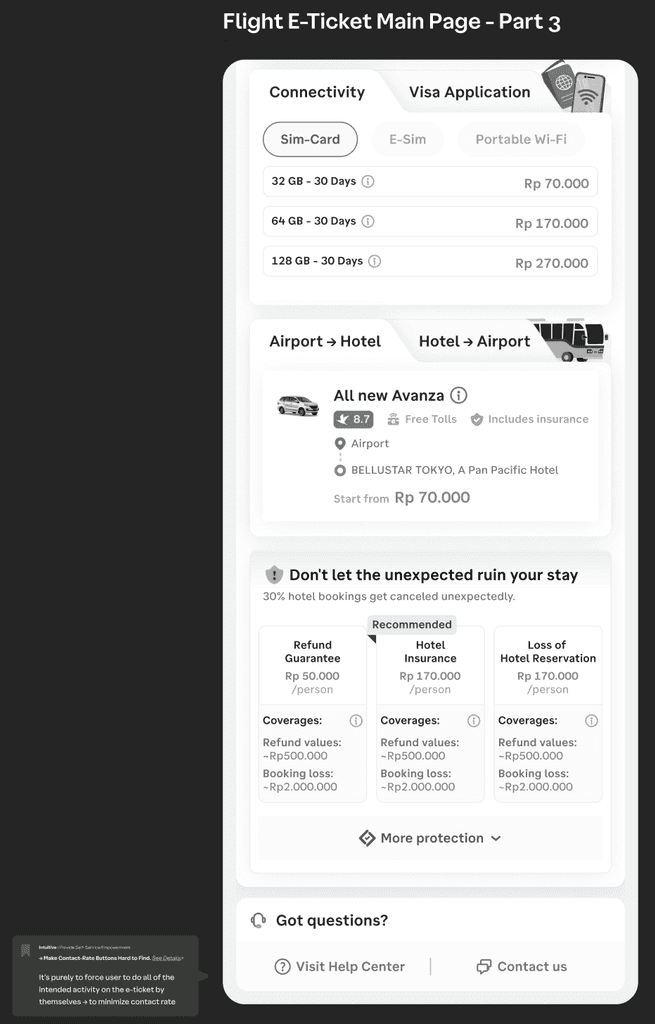
Dynamically Adjust Manage Booking/Consume E-ticket Display Based on Booking Context & T2-T3 moments*
Use specific moments (Booking Window) :
After Purchase (D-day → D+5 Issuance)
Before Consumptions (D-3 → D-day Consumptions)
Consumptions Period (D-day → End Consumptions)
Post Purchase (After Consumptions Date)
Make Contact-Rate-Risky Buttons Easy to Find but Make Contact-Rate Buttons Hard to Find
Place contact-rate-risky buttons, such as “Share E-ticket, Share Receipt, Refund, Reschedule” in prominent, consistent locations on the page.
Place Need Help or Customer Services button at the bottom of the page to make users ‘forced’ to do all of the activity by themselves
Use Progressive Disclosure
Organize content by providing the most important information first, while allowing users to explore further details if needed. We can use collapsible sections or tabs, or tray or modal, ensuring not all of the information provided all at once—we should not clutter the page with excessive information displayed all at once.
Visual Design Principle
Before convert the Low-fidelity into High-fidelity, we might need to defined the visual design priciple. This visual design principle can help us define the visual based on what we need / we wanna improved. Also it can help us to make our design more consistent
Minimum Dividers, Maximum Clarity between booking & x-sell
Keep the layout clean and cohesive using subtle visual separators only where needed.
Visual cues:
Use light dividers or soft background shades to separate booking actions from cross-sell offers.
Consistent & Clear Section Titles
Users should never wonder what a section is about — clarity builds trust.
Visual cues:
Use consistent title format across all sections.
Make sure each title describes the content clearly and directly.
Avoid creative or vague section header that reduces scanability.
Balanced Focus Between Booking & Cross-Sell
Ensure booking content and cross-sell offers are visually balanced to avoid user distraction.
Visual cues:
Cross-sell elements should not dominate or distract from core booking tasks.
Booking content should not completely overshadow helpful, relevant offers.
Use unified styling so both feel like a natural part of the same flow.
Cross-sell don’t need to be in very prominent, but at least can be shown a bit when users landed
Smart Section Separation
Users should feel guided — not overwhelmed — as they scan the page.
Visual cues:
Clearly separate each content section using subtle but visible indicators.
Use spacing, color blocks, or lines sparingly to create a readable flow.
Avoid visual clutter that makes the page feel dense or confusing.
Use Horizontal Space Wisely
Make layouts feel open and accessible while maintaining interaction comfort.
Visual cues:
Prioritize horizontal layouts where feasible to reduce scroll fatigue.
If vertical stacking is needed, provide ample breathing room and large tap targets.
Avoid overly tight or crowded layouts.
Button Hierarchy for Risk Clarity
Make action weight clear through button design.
Visual cues:
Contact/Rate/Risky Buttons: Use as secondary buttons — visible but non-dominant.
Destructive Actions (e.g. Refund/Reschedule): Use tertiary buttons — visually quiet to reduce accidental taps.
Avoid giving high-risk buttons strong visual prominence.
Closing the gap on the in-store experience
Frankim